


The Emotional Power of Color in Visual Storytelling
Color is more than just a visual element—it’s a language that speaks directly to our emotions. From the warm amber hues that evoke cozy autumn memories to the cool teal tones that make the ocean feel like a hidden secret, color has the power to transform an ordinary image into something deeply meaningful. It can turn a quiet portrait into a cinematic masterpiece or add a dramatic flair that captures attention instantly.
In the world of visual storytelling, emotion is often painted in pixels. No matter how strong your composition or subject is, it’s the color treatment that decides whether your audience feels nostalgia, energy, romance, or nothing at all. This makes understanding and using color intentionally a crucial skill for anyone looking to create impactful visuals.
Understanding the Emotional Impact of Color
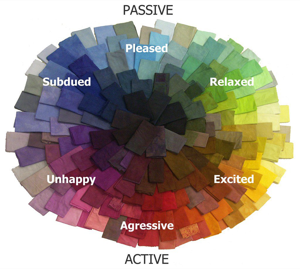
Color is not just about aesthetics; it’s a powerful tool that can shape the tone of your message. Just like accents in speech can change the meaning of words, subtle shifts in color can completely alter the mood of an image. Here are some key color categories and their emotional effects:
- Warm tones: Reds, oranges, and golds radiate vitality, intimacy, and nostalgia. They’re ideal for evoking feelings of warmth and comfort.
- Cool tones: Teal, green, and blue create a sense of calm, serenity, and distance. These are great for romantic portraits or images that convey a sense of home.
- Muted tones: These colors bring a grounded, sad, or vintage feel. Perfect for storytelling that leans into memory or nostalgia.
- Strong contrast: High contrast adds drama and intensity, making it ideal for emotional revelations or eye-catching visuals.
- Soft light: Dreamy, hopeful, and ethereal, soft lighting is perfect for weddings, newborn photos, or brand moments that require tenderness.
The key isn’t just knowing what colors do, but learning how to use them to support the story you’re trying to tell. This is where tools like Pippit come in handy, helping you refine the visual starting point before diving into the emotions.
Transforming a Single Image with Different Edits
Imagine uploading a simple photo of a girl sitting by a window—soft shadows, a distant stare, and natural lighting. Now, consider how four different edits can completely change the emotional response:
- Warm filter + vignette: This creates a cozy Sunday morning vibe, evoking thoughts of cinnamon tea and handwritten letters.
- Blue-green tones + sharp contrast: Suddenly, the image becomes melancholic, suggesting she might be waiting for someone who never arrives.
- Soft focus + pastel overlay: This transforms the scene into a dream sequence, where she’s lost in thought or remembering a childhood memory.
- Grayscale + high grain: The image becomes a flashback or a documentary still, feeling raw and grounded.
Same photo. Four completely different emotional reactions. That’s the power of intentional editing.
How to Use Pippit for Emotional Editing
Before you touch a filter, ask yourself: What do I want people to feel when they see this? If your image doesn’t stir anything, it might be that the color isn’t hitting the right note.
Pippit is more than just an editor—it becomes your emotional translator. Whether you’re an e-commerce brand boosting lifestyle shots or a creator curating a moody grid, Pippit’s tools help you nail the exact emotional tone.
To get started, register for Pippit Image Resolution Enhancer, select ‘Image Studio’ from the menu, and then choose ‘Upscale Image.’ Import your image by selecting ‘Device.’ Next, use ‘Image Enhancer’ to correct dullness and darkness, ‘Effects’ to add color, or ‘Retouch’ to enhance the subject’s face. You can also alter texture, features, create collages, apply stickers, shapes, and overlay text.
Once you’re done, click ‘Download’ in the upper right corner of the Pippit enhancer image. Choose the format and size, then click ‘Download’ at the bottom.
Mastering the Silent Language of Color
Think of your image as a momentary short film. The lighting, the tones, the contrast—all of it either supports your story or contradicts it. A founder’s story in high-saturation blue might not feel as personal, while a soft, vintage-looking product image could resonate more with a lifestyle audience.
Here are some tips to master this silent language:
- Match warmth to memory: Warmer tones trigger nostalgia and memory—great for throwbacks or sentimental posts.
- Use contrast for energy: Boost contrast to make your image pop on a feed. It adds urgency and intention.
- De-saturate for intimacy: Lower saturation brings closer emotion. It’s why old photos feel more real.
- Test before you post: Preview your image in light and dark mode on your phone. Mood changes based on background.
These small shifts can mean the difference between a scroll past and a save-for-later.
Elevate Your Visuals with Pippit
Whether you’re telling your brand story, re-editing old travel snaps, or creating graphics that convert, Pippit gives you all the emotional editing tools in one place. From video frame extraction via URL to deeply customizable photo filters and mood-crafting features, you can start with any moment and elevate it into something memorable.
So go ahead—turn those flat photos into emotional magnets. Play with light. Push the shadows. Enhance the moment. And make your images not just scroll-worthy… but soul-stirring.